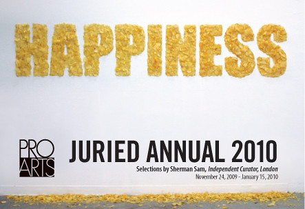
by Adam Green
2008
Congratulations, Adam!
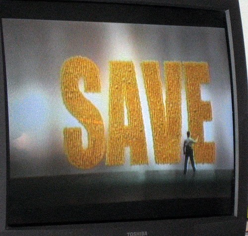
I don't know about you, but I see more than a casual similarity between Adam's piece, originally from 2008, and the current image from Safeway's SAVE campaign.
In the Safeway ad, the letters are made up of post-its with marked down prices rather than potato chips, but visually they're nearly indistinguishable. Same font and everything. I'm just sayin'.
Adam wrote:
I did notice this ad campaign. I believe the original happiness preceded this campaign by about a year... it was however inspired by a trip to Safeway at three in the morning.
I'm impressed by the evenhanded sangfroid of his response.
I did notice this ad campaign. I believe the original happiness preceded this campaign by about a year... it was however inspired by a trip to Safeway at three in the morning.


No comments:
Post a Comment